ClassPass's website and app needed facelifts since its 2015 inception, so it was time to reimagine everything from site architecture, to new feature sets, and performance marketing.
Truly a cross-functional feat, marketing, engineering, research, and partnerships orgs set about to tell the story of Classpass with the customer’s experience at top of mind.
The results spoke for themselves. We saw conversion increase by 40% in the first week alone and twice the time on site spent on every page. Users particularly loved the app tour and the improved map functionalities, allowing them greater access into the product offering and giving them all the information they would need to ultimately purchase the right plan for them.
Capacities
Art direction, web design, product design
Client
ClassPass
Year
2017


Post-it posits
I can’t even begin to count how many post-its we used for our design sprints on this project, but it was a truly illuminating (and rigorous) exercise. We saw a lot of inefficiencies in how our site was architected and a lot of opportunities to optimize performance and down-funnel conversions. The customer was truly top of mind throughout this project.
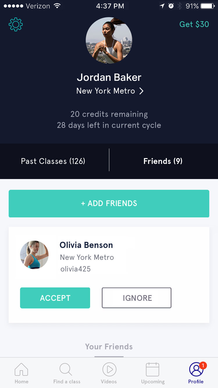
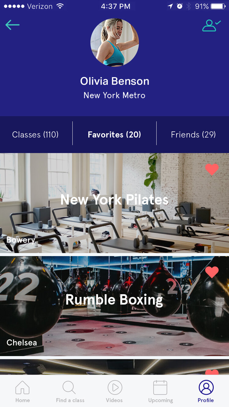
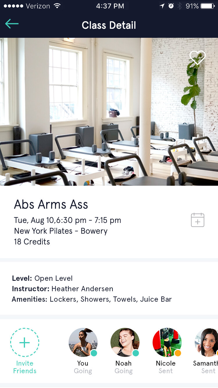
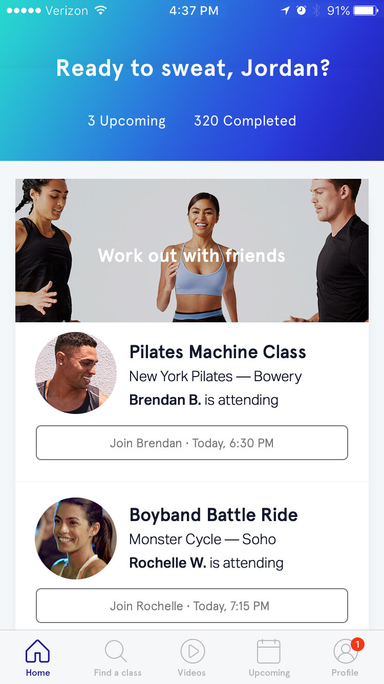
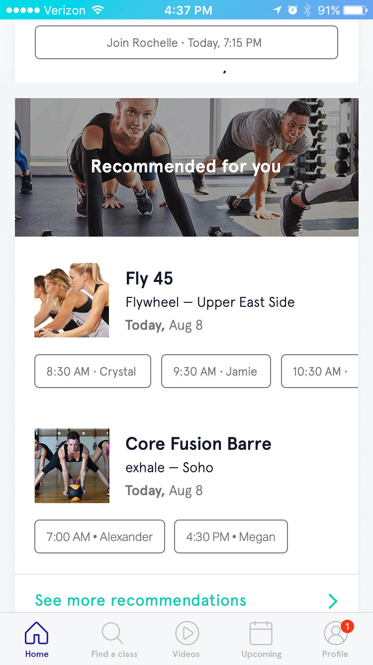
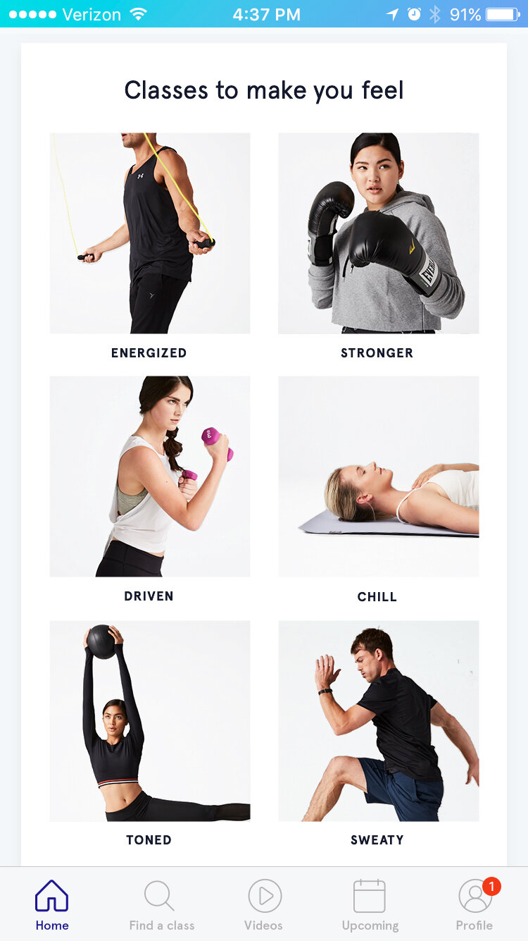
How could we make it really easy for the user to discover new workouts in their area and also seamlessly book their favorites? How could we show prospects the breadth of our offering without overwhelming them? How could we make it easy for friends to take classes together and have access to privacy controls that worked for them?